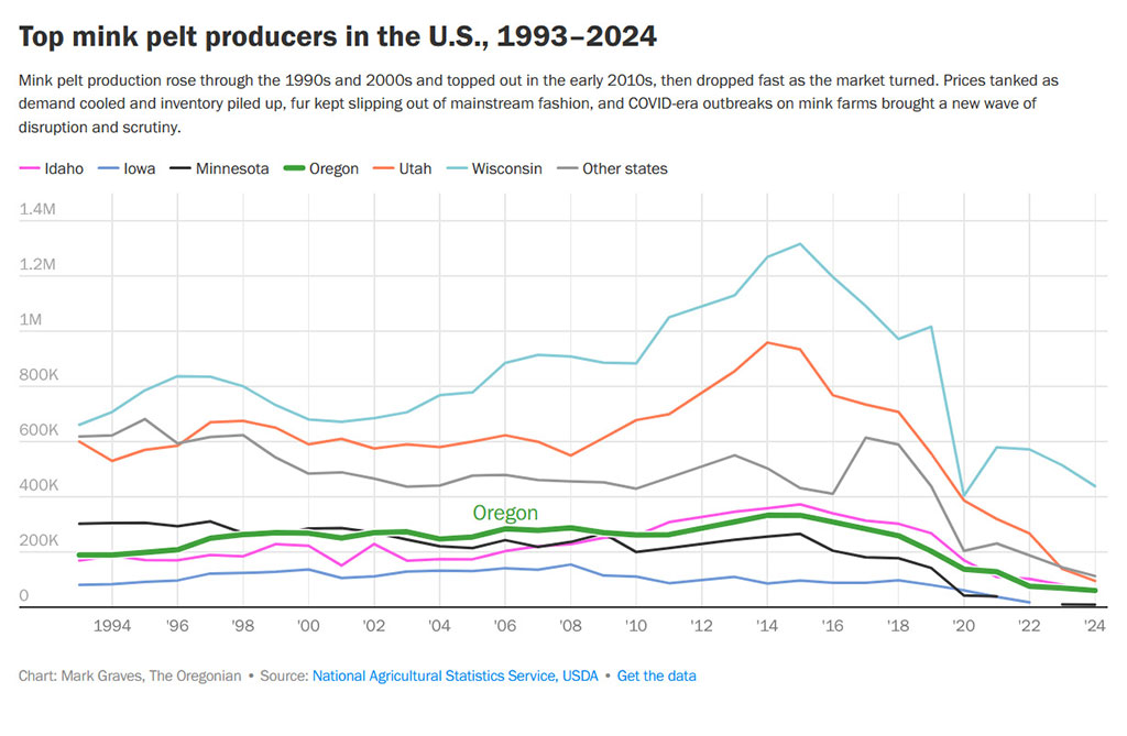
The data (mink "production" by state) in this chart from a recent article in The Oregonian newspaper is not new, but it's encouraging to see in a visual format.
tags: USDA

The data (mink "production" by state) in this chart from a recent article in The Oregonian newspaper is not new, but it's encouraging to see in a visual format.